The challenge
A leading provider of scientific environmental monitoring equipment, needed a new visual identity.
Based in Sydney, Australia, WAM Scientific has built a reputation for its professional, high-quality services. However, their existing brand was tired and outdated, failing to reflect the precision and expertise that defined their work.
Goal 1
Create a new visual identity that would not only look professional but also communicate the company's core focus and excellence.
Goal 2
It must resonate with a discerning audience within the engineering, construction and scientific services industry.
My approach
A strategic refresh
I began by conducting a deep dive into WAM Scientific's business, understanding their clients, their services, and their reputation in the industry. It was clear that the new visual identity needed to be contemporary, clean, trustworthy, and subtly sophisticated to stand-out amongst their peers. There was a gap in the market for a business that exceeds at quality scientific services while also demonstrating this pride, quality and dedication to being the best through their visual branding.
I focused on the two core elements of their work: water and air quality testing.
I understand the importance of the logo being one of the most valuable assets that a company has in terms of visual realestate. No other asset is shown more frequently. A logo has the potential power to communicate the core essence of a business and convert new customers with just a glance.
The solution
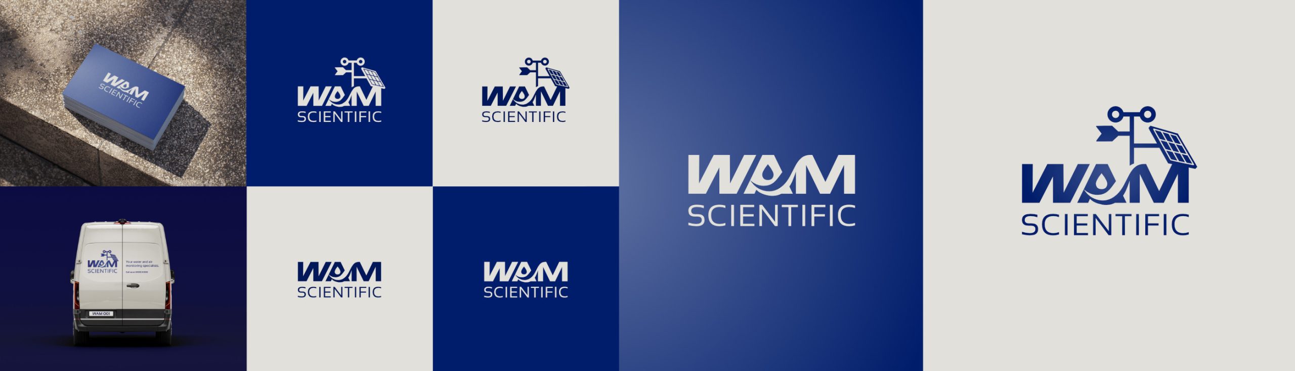
A dual-logo system
I developed a dual-logo system and colour scheme to ensure the brand could be consistently applied across all digital platforms and physical applications. Adapting to different contexts while maintaining its core identity, fostering clarity for new customers and reinforcing excellence and consistency for existing customers.

The primary logo:A wordmark of quality and precision
The primary logo is a wordmark that subtly integrates the brand’s key specialisations. I customised the letterforms to include symbolic additions: a droplet element within the ‘A’ for water, and a subtle upward sweep on the symbolic airwave for air.
A subtle, yet significant, check mark is integrated into the airwave, providing a subconscious cue to quality and reliability—the peace of mind clients get when working with WAM Scientific.
The design is intentionally simple and clean, exuding professionalism and trustworthiness. Its rectangular format makes it highly versatile, perfect for digital applications like websites and social media, as well as for branded merchandise and as a partner logo on other business sites. The thoughtfully designed logo speaks volumes, positioning WAM Scientific as a leader in its field.
The secondary logo:A combination mark for immediate business context
This secondary logo is perfect for high-impact or longer-view-time applications, such as on a company van or, on signage, where it can provide a strong, immediate visual connection to the brand’s services. It adds value to branded visual real estate and provides a more complete picture of WAM Scientific’s work.
This combination mark is a taller variant of the primary wordmark, with the addition of an abstracted scientific monitoring station icon. This element immediately and unequivocally communicates the company’s business activities to new audiences, making the business activities instantly identifiable.
The result
Immediate positive feedback
The launch of the new visual identity was met with an overwhelmingly positive response. The new brand identity has successfully elevated WAM Scientific’s presence, accurately reflecting their high-caliber services.
The client immediately received numerous compliments from partners and industry peers who praised the professional and contemporary look. It has opened the door for future collaborations, proving that a thoughtful, strategic visual identity is a crucial foundation for a strong and enduring brand.
Future possibilities
This project has solidified a strong working relationship with the client, keen to continue our partnership on more customer-facing assets, such as potential future work for their website, online advertising, and other branded materials.
An inspired client
This successful visual identity refresh has not only transformed WAM Scientific’s image but has also inspired their team to see themselves in a new professional era.
Client feedback
"Valeria’s communication was excellent and her understanding of our needs really portrays in her design of our new logo.Valeria worked promptly, showcased professionalism and elegance within a simple yet effective design. We and our clients love our new branding!Would highly recommend Valeria’s services!”
— William Pak, Managing Director at WAM Scientific

The designer
Valeria Domanski
A multi-disciplined principal designer with over 12 years of professional experience.
Her work spans award-winning agencies and brands, as well as her own freelance practice.
With a focus on design leadership, art direction, creative direction, visual identity, business discovery, UX/UI for websites, eCommerce, and apps, Valeria specialises in a holistic approach to brand presence and designed solutions, from strategy to implementation.